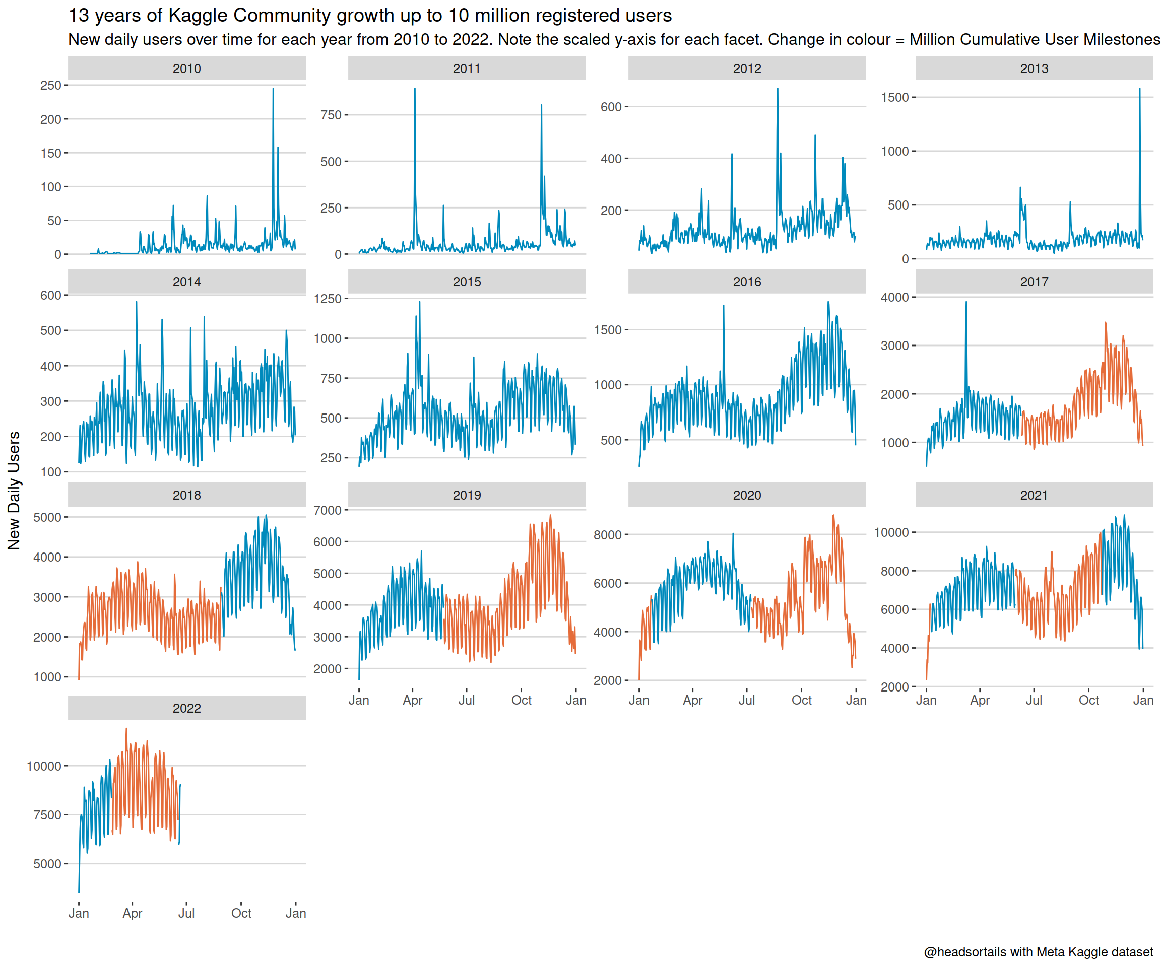
A few days ago, the Kaggle community crossed the amazing milestone of 10 million registered users! In celebration, I’ve put together a forum post that visualises the accelerated growth over the years. Here I show the R code behind those plots and talk a bit about my visualisation choices.
For this post, we’ll need a small set of fundamental libraries:
libs <- c('dplyr', 'readr',         # wrangling
          'lubridate', 'ggrepel',   # datetime, plots
          'ggthemes', 'ggplot2')    # plots
invisible(lapply(libs, library, character.only = TRUE))
The data we’ll be using are a slightly processed version of what’s available from the public Meta Kaggle dataset. I downloaded the Users.csv table and aggregated the daily user counts and cumulated counts into this input table:
users <- read_csv("../../static/files/users_daily.csv", col_types = cols())Before we break it down, here’s the full visual to illustrate the growth of the community:
foo <- users %>%
  filter(date < max(date)) %>%
  mutate(millions = ct %/% 1e6) %>%
  mutate(year = year(date))

year(foo$date) <- 2017

col_values = rep(c("#008abc", "#e56c3a"), 10)[1:nrow(distinct(foo, millions))]

foo %>%
  ggplot(aes(date, n, col = as.factor(millions))) +
  geom_line(na.rm = TRUE) +
  facet_wrap(~ year, scales = "free_y") +
  scale_x_date(date_labels= "%b") +
  scale_color_manual(values = col_values) +
  theme_hc() +
  theme(legend.position = "none") +
  labs(x = "", y = "New Daily Users",
  title = "13 years of Kaggle Community growth up to 10 million registered users",
  subtitle = "New daily users over time for each year from 2010 to 2022. Note the scaled y-axis for each facet. Change in colour = Million Cumulative User Milestones.",
caption = "@headsortails with Meta Kaggle dataset") 
I chose this chart to visualise the accelerated growth over the years: Each change in colour represents the crossing of a million users milestone. In addition to the growth trend, the plot also showcases the seasonal pattern, the weekly cycle, and some interesting spikes.
But most prominently, the periods between colour changes are becoming shorter and shorter as the user numbers increase faster and faster. From 2016 being the last year with only a single colour, we crossed the 1 million users mark in 2017, and 2021 showed a total of four colour changes.
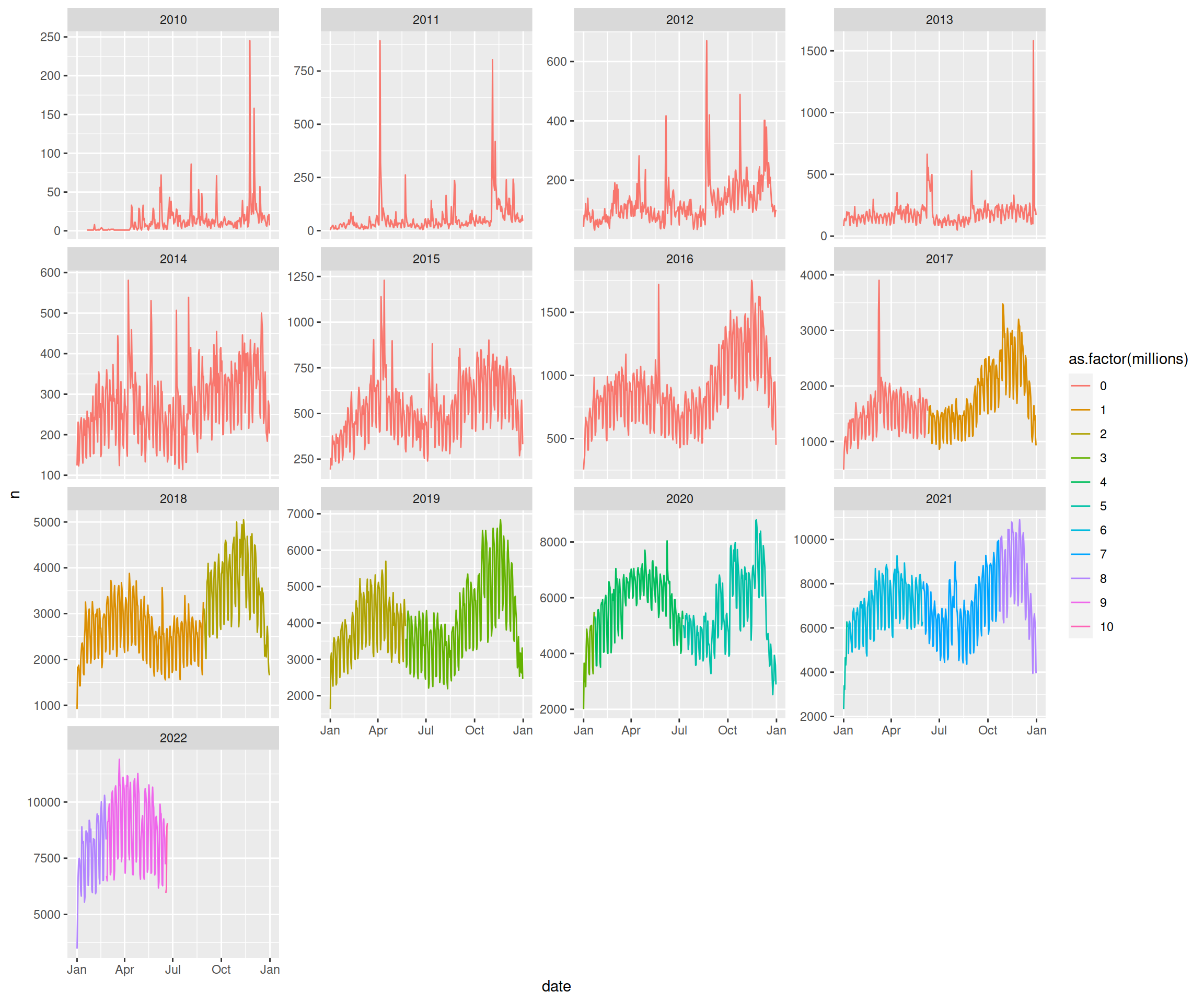
The construction of the plot starts with a little trick. After extracting a year column, we’ll transform the year of each date to 2017. This way, we can construct a facet wrap visual that still shows each year but also has shared x-axes. Maybe there’s a more elegant way to do this, but it works for me. (And why 2017? Because that’s the year I joined the Kaggle community. But that year doesn’t appear in the plot, so it’s a subtle easter egg for myself.) The millions column will help with the colouring:
foo <- users %>%
  filter(date < max(date)) %>%
  mutate(millions = ct %/% 1e6) %>%
  mutate(year = year(date))

year(foo$date) <- 2017
We’re getting the sequence of colours dynamically based on the number on million user milestones:
col_values = rep(c("#008abc", "#e56c3a"), 10)[1:nrow(distinct(foo, millions))]The actual visual starts with a line plot of daily users, which is split into facets by year. The modification of the date feature now allows us share the x-axis between each facet. Here we haven’t done any styling on the theme or colours yet.
foo %>%
  ggplot(aes(date, n, col = as.factor(millions))) +
  geom_line(na.rm = TRUE) +
  facet_wrap(~ year, scales = "free_y") +
  scale_x_date(date_labels= "%b")
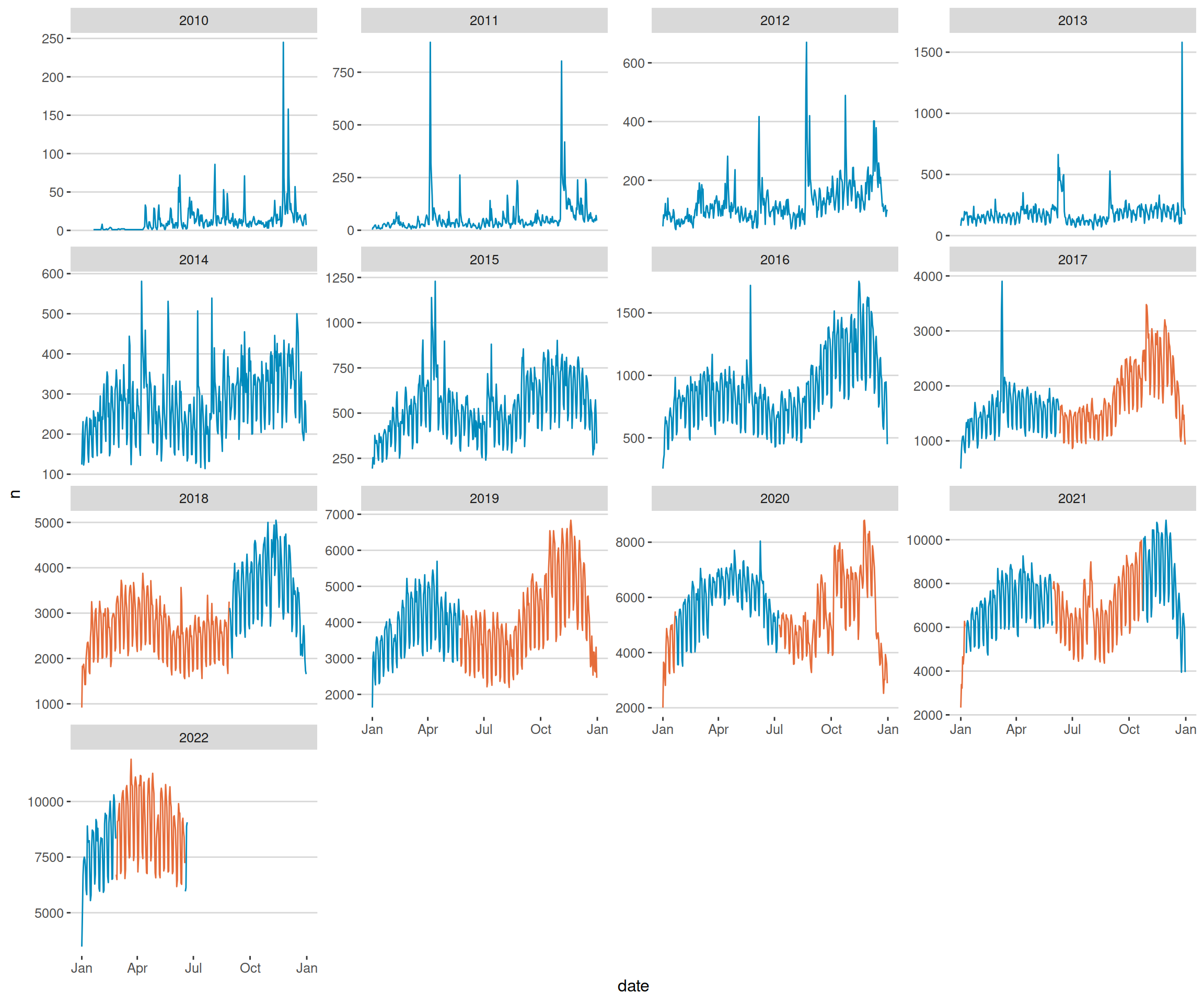
Now we’re adding the alternating colours and choose a theme that fades a bit more into the background. The colour legend disappears; we will describe the colours in the subtitle instead:
foo %>%
  ggplot(aes(date, n, col = as.factor(millions))) +
  geom_line(na.rm = TRUE) +
  facet_wrap(~ year, scales = "free_y") +
  scale_x_date(date_labels= "%b") +
  scale_color_manual(values = col_values) +
  theme_hc() +
  theme(legend.position = "none")
The final touches: we remove the x-axis label, since a date axis is pretty self-explanatory. Adding a title to communicate the big picture. And a subtitle to put an emphasis on some plot details:
foo %>%
  ggplot(aes(date, n, col = as.factor(millions))) +
  geom_line(na.rm = TRUE) +
  facet_wrap(~ year, scales = "free_y") +
  scale_x_date(date_labels= "%b") +
  scale_color_manual(values = col_values) +
  theme_hc() +
  theme(legend.position = "none") +
  labs(x = "", y = "New Daily Users",
  title = "13 years of Kaggle Community growth up to 10 million registered users",
  subtitle = "New daily users over time for each year from 2010 to 2022. Note the scaled y-axis for each facet. Change in colour = Million Cumulative User Milestones.",
caption = "@headsortails with Meta Kaggle dataset") 
The accelerated growth of the community is testament to Kaggle’s great reputation as the home for Machine Learning and Data Science. Back when I joined, 5 years ago in 2017, I was user ID 1,014,468. Since then, so much has happened: competitions have shifted their focus from tabular to NLP & Vision (with Deep Learning); we got a Datasets category; Discussion communities came and went; Kernels became Notebooks; Notebooks competitions became more frequent; and so much more.
Many new faces rose to popularity through their creative and inspiring contributions. And many seasoned Kagglers grew their skillset by being consistently innovative and supportive. We had the occasional drama or argument; but who doesn’t? Through all this, the community grew faster and faster, by an order of magnitude, to keep up with the breathless developments in Machine Learning.
Everything points towards this growth continuing in the near future. As a community, we are in a unique position to learn from the ongoing advancements in Data Science and Machine Learning, and to contribute our practitioner’s perspective to these exciting developments. It is also our responsibility to preserve the welcoming and supportive nature of our community, to nurture talent and enthusiasm, to fight spam, to maintain a safe and inclusive environment, to promote meritocracy, and to stay curious.
There are many new adventures, but also challenges ahead of us.
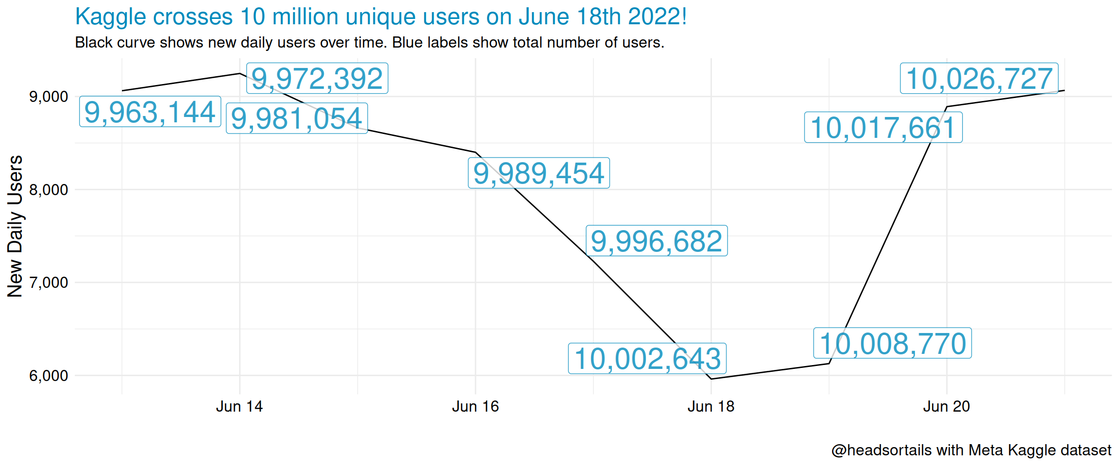
Finally, here’s a bonus plot for you to deconstruct. This visualisation records the day of June 18th 2022, when the Kaggle community first reached 10 million unique registered members.
users %>%
    filter(date >= date("2022-06-20") - 7) %>%
    filter(date != max(date)) %>%
    group_by(date) %>%
    mutate(lab = max(ct)) %>%
    ungroup()  %>%
    ggplot(aes(date, n)) +
    geom_line(col = "black") +
    geom_label_repel(aes(date, n, label = scales::comma(lab)), size = 8, col = "#008abc",
                     alpha = 0.8, force = 10, na.rm = TRUE) +
    scale_y_continuous(labels = scales::comma) +
    labs(x = "", y = "New Daily Users",
        title = "Kaggle crosses 10 million unique users on June 18th 2022!",
        subtitle = "Black curve shows new daily users over time. Blue labels show total number of users.",
        caption = "@headsortails with Meta Kaggle dataset") +
    theme_minimal() +
    theme(axis.text = element_text(size = 12, colour = "black"),
          title = element_text(size = 15, colour = "#008abc"),  # "#e56c3a"
          axis.title = element_text(colour = "black"),
         plot.subtitle = element_text(size = 12, colour = "black"),
         plot.caption = element_text(colour = "black"))
Have fun!