This week, the Kaggle Hidden Gems Competition is featured in a special crossover event with the fantastic TidyTuesday project to further strengthen the connections between the R & Kaggle communities. The TidyTuesday participants are invited to expand their beautifully crafted data visuals into narrative notebooks on the Kaggle platform, and receive feedback and prizes for their work. This post will briefly describe my goals and motivation for this collaboration, and then show the code for one of my own visuals where I learned how to include images in ggplot2 barplots.
The @R4DScommunity welcomes you to week 17 of #TidyTuesday! We're exploring Kaggle Hidden Gems courtesy of @heads0rtai1s !!
— Tom Mock ❤️ Quarto (@thomas_mock) April 25, 2022
📂 https://t.co/sElb4fcv3u
🗞 https://t.co/OVy4t58mvO#r4ds #tidyverse #rstats #dataviz pic.twitter.com/MP85A6im6h
A TidyTuesday crossover episode
The TidyTuesday series is a long-running project organised by Tom Mock and the R4DS online learning community and largely run on Twitter. Every week sees a new dataset, in varying states of tidiness, and the challenge is to wrangle, explore, and visualise this data. And each week the participants continue to delight and astonish with their creative solutions.
The goals of TidyTuesday have a strong overlap with those of my Kaggle Hidden Gems competition, about which I wrote in last week’s post. For me, visualisations are at the heart of effective data science communication. The notebook format of the Hidden Gems challenge now opens up the opportunity to take those visuals and embed them into an engaging and accessible story.
I’ve already seen multiple great visuals through the #TidyTuesday and #Rstats hashtags on Twitter, and I plan to collect most or all of them in a future post.
Practice new ideas: Images in Barplots
One major motivation for initiatives like TidyTuesday or this crossover project is to give the participants the opportunity to practice their data & dataviz skills, and to learn and showcase new tools and ideas. When I wrote my Starter Notebook for the Hidden Gems data I did something similar and decide to challenge myself to learn how to include (png) images in plots.
Here, I’m breaking down one of those plots, which uses the self-contained kaggle_hidden_gems.csv dataset to study the frequencies of social media links on the profiles of the Hidden Gems authors.
First, we get our required libraries:
libs <- c('dplyr', 'tibble',      # wrangling
          'tidyr', 'stringr',     # wrangling
          'tidytuesdayR',         # tidytuesday
          'gt',                   # tables
          'grid', 'magick',       # images, plots
          'ggthemes', 'ggplot2')  # plots
invisible(lapply(libs, library, character.only = TRUE))
The dataset itself is publicly available on Kaggle, and through the TidyTuesday crossover it can now also be accessed via the tidytuesdayR package like this:
tuesdata <- tidytuesdayR::tt_load('2022-04-26')##
## Downloading file 1 of 1: `hidden_gems.csv`gems <- tuesdata$hidden_gemsThe detailed exploration of the dataset and its features is of course the goal of the Hidden Gems Competition and the TidyTuesday challenge, so here I’ll be focussing only on this narrow question: what percentage of Hidden Gems authors have a Twitter link in their bio vs a LinkedIn link?
Here we are interested in the features author_twitter and author_linkedin that contain the social links. We’re reformatting those columns a little and pivot them to a longer table. This is so that we can group by the social media platform and extract the fractions of authors that display those links in their profiles. Note, that this code is more elegant than what I originally wrote for the starter notebook:
foo <- gems %>%
  distinct(author_twitter, author_linkedin) %>%
  pivot_longer(everything(), names_to = "media", values_to = "links") %>%
  mutate(media = str_to_title(str_replace(media, "author_", ""))) %>%
  group_by(media) %>%
  summarise(total = n(),
            ct = sum(!is.na(links)),
            frac = mean(!is.na(links)))

foo %>%
gt()| media | total | ct | frac |
|---|---|---|---|
| 188 | 171 | 0.9095745 | |
| 188 | 91 | 0.4840426 |
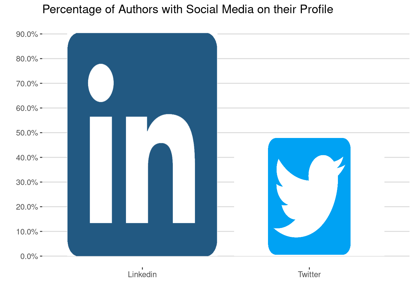
We see that there are 188 distinct authors in total, and that 91% have their LinkedIn displayed but only 48% their Twitter. That’s a notable difference, and it provides interesting insights into how Kaggle profiles might be used and perceived in a wider social context.
We could turn this into a simple barplot and be done here, but our goal is to practice using images. We will use the logos of the respective platforms, which I’ve downloaded and made available in the Hidden Gems dataset for convenience.
We will make a little helper table that contains the image path:
path_img <- "/pics/"

img_d <- tibble(
  media = c("Linkedin", "Twitter"),
  img = str_c(path_img, c("linkedIn_logo.png", "twitter_logo_v2.png"))
)

img_d %>%
gt()| media | img |
|---|---|
| /pics/linkedIn_logo.png | |
| /pics/twitter_logo_v2.png |
And here’s the plot itself in a single cell:
p <- foo %>%
  ggplot(aes(media, frac)) +
  geom_col(fill = "white") +
  scale_y_continuous(labels = scales::percent, breaks = seq(0, 1, 0.1)) +
  theme_hc() +
  theme(legend.position = "none") +
  labs(x = "", y = "", title = "Percentage of Authors with Social Media on their Profile")

p_dat <- ggplot_build(p)

p_map <- p_dat$data[[1]] %>%
  select(xmin, xmax, ymin, ymax) %>%
  bind_cols(foo %>% select(media)) %>%
  left_join(img_d, by = "media")

for (i in seq(nrow(p_map))){

  p <- p +
    annotation_custom(
      grid::rasterGrob(image_read(p_map$img[i]),
                 width = unit(1, "npc"),
                 height = unit(1, "npc")),
      xmin = p_map$xmin[i],
      xmax = p_map$xmax[i],
      ymin = p_map$ymin[i],
      ymax = p_map$ymax[i])
}

print(p)
You see that the logos now act like the bars in the plot, and are scaled to the height of the bar. It’s easy to get carried away with effects like this, but I think with only a few images and a clean style the plot still remains readable and informative.
Ok, now let’s break it down.
We first build the barplot in the normal way with geom_col. The bars add like a white background, but we could also turn them fully transparent. We format the y-axis with percentages, add a nice theme and a title to set up our canvas:
p <- foo %>%
  ggplot(aes(media, frac)) +
  geom_col(fill = "white") +
  scale_y_continuous(labels = scales::percent, breaks = seq(0, 1, 0.1)) +
  theme_hc() +
  theme(legend.position = "none") +
  labs(x = "", y = "", title = "Percentage of Authors with Social Media on their Profile")

print(p)
You see that the plot style is already there, and we only need to fill in the images. We achieve that by first deconstruct the plot object from above via ggplot_build into a set of components that can be used to render the graph.
p_dat <- ggplot_build(p)The outcome is a list with three entries: data (the bars), layout (the plot settings), and plot (the rendered outcome). I’m not going to show all of it here, but you can easily print and inspect it. For our purposes, we will take the data entry and add our image links:
p_map <- p_dat$data[[1]] %>%
  select(xmin, xmax, ymin, ymax) %>%
  bind_cols(foo %>% select(media)) %>%
  left_join(img_d, by = "media")

p_map %>%
gt()| xmin | xmax | ymin | ymax | media | img |
|---|---|---|---|---|---|
| 0.55 | 1.45 | 0 | 0.9095745 | /pics/linkedIn_logo.png | |
| 1.55 | 2.45 | 0 | 0.4840426 | /pics/twitter_logo_v2.png |
This gives us the dimensions of the bars and the image that we want to add to them. Now all that’s left is to loop through this table and add the image.
Here, annotation_custom is a ggplot2 helper for inserting images or decorations. The images themselves are read by image_read from the magick package and rendered by rasterGrob from the grid package. Then we’re setting the x and y dimensions according to the plot data and the final plot is ready:
for (i in seq(nrow(p_map))){

  p <- p +
    annotation_custom(
      grid::rasterGrob(magick::image_read(p_map$img[i]),
                 width = unit(1, "npc"),
                 height = unit(1, "npc")),
      xmin = p_map$xmin[i],
      xmax = p_map$xmax[i],
      ymin = p_map$ymin[i],
      ymax = p_map$ymax[i])
}

print(p)
There are many variations possible here, including images as backgrounds, images on top bars (which I’m doing in my starter notebook for R vs Python insights), logos in image corners, and much more. If used sparingly, these kind of visual elements can enrich your visuals and insights presentations.
Got interested in playing with these kind of plots? I’d love to see your ideas!
Join the Hidden Gems challenge and show us your skills, or fork my Starter Notebook to tinker with the code and get inspired.
The TidyTuesday crossover is still running, and you are very welcome to share your ideas with the community on Twitter.
Have fun!