The first four months of 2020 have been dominated by the Coronavirus pandemic (aka COVID-19), which has transformed global life in an unprecedented way. Societies and economies struggle to adapt to the new conditions and necessary contraints. A reassuringly large fraction of governments around the world continue to take evidence-based approaches to this crisis that are grounded in large scale data collection efforts. Most of this data is being made publicly available and can be studied in real time. This post will describe how to extract and prepare the necessary data to animate the spread of the virus over time within my native country of Germany.
I have published a pre-processed version of the relevant data for this project as a Kaggle dataset, together with the geospatial shape files you need to plot the resulting map. This post outlines how to build that dataset from the original source data using a set of tidyverse tools. Then we will use the gganimate and sf packages to create animated map visuals.
Those are the packages we need:
libs <- c('dplyr', 'tibble',      # wrangling
          'stringr', 'readr',     # strings, input
          'lubridate', 'tidyr',   # time, wrangling
          'knitr', 'kableExtra',  # table styling
          'ggplot2', 'viridis',   # visuals
          'gganimate', 'sf',      # animations, maps
          'ggthemes')             # visuals
invisible(lapply(libs, library, character.only = TRUE))
The COVID-19 data for Germany are being collected by the Robert Koch Institute and can be download through the National Platform for Geographic Data (which also hosts an interactive dashboard). The earliest recorded cases are from 2020-01-24. Here we define the corresponding link and read the dataset:
infile <- "https://opendata.arcgis.com/datasets/dd4580c810204019a7b8eb3e0b329dd6_0.csv"
covid_de <- read_csv(infile, col_types = cols())
This data contains a number of columns which are, unsurprisingly, named in German:
covid_de %>%
  head(5) %>%
  glimpse()
## Observations: 5
## Variables: 18
## $ FID <dbl> 4281356, 4281357, 4281358, 4281359, 4281360
## $ IdBundesland <dbl> 1, 1, 1, 1, 1
## $ Bundesland <chr> "Schleswig-Holstein", "Schleswig-Holstein",…
## $ Landkreis <chr> "SK Flensburg", "SK Flensburg", "SK Flensbu…
## $ Altersgruppe <chr> "A15-A34", "A15-A34", "A15-A34", "A15-A34",…
## $ Geschlecht <chr> "M", "M", "M", "M", "M"
## $ AnzahlFall <dbl> 1, 1, 1, 1, 1
## $ AnzahlTodesfall <dbl> 0, 0, 0, 0, 0
## $ Meldedatum <chr> "2020/03/14 00:00:00", "2020/03/19 00:00:00…
## $ IdLandkreis <chr> "01001", "01001", "01001", "01001", "01001"
## $ Datenstand <chr> "30.04.2020, 00:00 Uhr", "30.04.2020, 00:00…
## $ NeuerFall <dbl> 0, 0, 0, 0, 0
## $ NeuerTodesfall <dbl> -9, -9, -9, -9, -9
## $ Refdatum <chr> "2020/03/16 00:00:00", "2020/03/13 00:00:00…
## $ NeuGenesen <dbl> 0, 0, 0, 0, 0
## $ AnzahlGenesen <dbl> 1, 1, 1, 1, 1
## $ IstErkrankungsbeginn <dbl> 1, 1, 1, 1, 1
## $ Altersgruppe2 <chr> "nicht übermittelt", "nicht übermittelt", "…The following code block reshapes and translates the data to make it better accessible. This includes replacing our beloved German umlauts with simplified diphthongs, creating age groups, and aggregating COVID-19 numbers by county, age group, gender, and date:
covid_de <- covid_de %>%
  select(state = Bundesland,
         county = Landkreis,
         age_group = Altersgruppe,
         gender = Geschlecht,
         cases = AnzahlFall,
         deaths = AnzahlTodesfall,
         recovered = AnzahlGenesen,
         date = Meldedatum) %>%
  mutate(date = date(date)) %>%
  mutate(age_group = str_remove_all(age_group, "A")) %>%
  mutate(age_group = case_when(
    age_group == "unbekannt" ~ NA_character_,
    age_group == "80+" ~ "80-99",
    TRUE ~ age_group
  )) %>%
  mutate(gender = case_when(
    gender == "W" ~ "F",
    gender == "unbekannt" ~ NA_character_,
    TRUE ~ gender
  )) %>%
  group_by(state, county, age_group, gender, date) %>%
  summarise(cases = sum(cases),
            deaths = sum(deaths),
            recovered = sum(recovered)) %>%
  ungroup() %>%
  filter(cases >= 0 & deaths >= 0) %>%
  filter(date < today()) %>%
  mutate(state = str_replace_all(state, "ü", "ue")) %>%
  mutate(state = str_replace_all(state, "ä", "ae")) %>%
  mutate(state = str_replace_all(state, "ö", "oe")) %>%
  mutate(state = str_replace_all(state, "ß", "ss")) %>%
  mutate(county = str_replace_all(county, "ü", "ue")) %>%
  mutate(county = str_replace_all(county, "ä", "ae")) %>%
  mutate(county = str_replace_all(county, "ö", "oe")) %>%
  mutate(county = str_replace_all(county, "ß", "ss")) %>%
  mutate(county = str_remove(county, "\\(.+\\)")) %>%
  mutate(county = str_trim(county))
The result is a dataset that lists daily (not cumulative!) cases, deaths, and recovered cases for 6 age groups, gender, and the German counties and their corresponding federal states. Similar to the US, Germany has a federal system in which the 16 federal states have a large amout of legislative power. The German equivalent of the US county is the “Kreis”, which can either be associated with a city (“Stadtkreis” = “SK”) or the country side (“Landkreis” = “LK”). Here only a subset of columns are shown for reasons of clarity:
covid_de %>%
  filter(state == "Sachsen") %>%
  select(-deaths, -recovered) %>%
  head(5) %>%
  kable() %>%
  column_spec(1:6, width = c("15%", "25%", "15%", "10%", "25%", "10%")) %>%
kable_styling()| state | county | age_group | gender | date | cases |
|---|---|---|---|---|---|
| Sachsen | LK Bautzen | 00-04 | F | 2020-03-20 | 1 |
| Sachsen | LK Bautzen | 00-04 | F | 2020-04-07 | 2 |
| Sachsen | LK Bautzen | 00-04 | M | 2020-03-21 | 1 |
| Sachsen | LK Bautzen | 05-14 | F | 2020-03-20 | 1 |
| Sachsen | LK Bautzen | 05-14 | F | 2020-03-21 | 1 |
This is the cleaned dataset which is available on Kaggle as covid_de.csv. With this data, you can already already slice and analyse Germany’s COVID-19 characteristics by various demographic and geographical features.
However, for the maps that we’re interested in one more input is missing: shapefiles. A shapefile uses a standard vector format for specifying spatial geometries. It packages the map boundary data of the required entities (like countries, federal states) into a small set of related files. For this project, I found publicly available shapefiles on the state and county level provided by Germany’s Federal Agency for Cartography and Geodesy. Both levels are available in the Kaggle dataset. Here I put the county level files (de_county.*) into a local, static directory.
Shapefiles can be read into R using the sf package tool st_read. In order to soon join them to our COVID-19 data, we need to do a bit of string translating and wrangling again. The tidyr tool unite is being used to combine the county type (BEZ in c("LK", "SK")) and county name into the format we have in our COVID-19 data:
shape_county <- st_read(str_c("../../static/files/", "de_county.shp"), quiet = TRUE) %>%
  rename(county = GEN) %>%
  select(county, BEZ, geometry) %>%
  mutate(county = as.character(county)) %>%
  mutate(county = str_replace_all(county, "ü", "ue")) %>%
  mutate(county = str_replace_all(county, "ä", "ae")) %>%
  mutate(county = str_replace_all(county, "ö", "oe")) %>%
  mutate(county = str_replace_all(county, "ß", "ss")) %>%
  mutate(county = str_remove(county, "\\(.+\\)")) %>%
  mutate(county = str_trim(county)) %>%
  mutate(BEZ = case_when(
    BEZ == "Kreis" ~ "LK",
    BEZ == "Landkreis" ~ "LK",
    BEZ == "Stadtkreis" ~ "SK",
    BEZ == "Kreisfreie Stadt" ~ "SK"
  )) %>%
  unite(county, BEZ, county, sep = " ", remove = TRUE)
At this stage, there are still some county names that don’t match precisely. It would have been too easy, otherwise. These cases mostly come down to different styles of abbreviations being used for counties with longer names. A scalable way to deal with these wonders of the German language would be fuzzy matching by string distance similarities. Here, the number of mismatches is small and I decided to adjust them manually.
Then, I group everything by county and date and sum over the remaining features. One major issue here is that not all counties will report numbers for all days. Those are small areas, after all. In this dataset, these cases are implicitely missing; i.e. the corresponding rows are just not present. It is important to convert those cases into explicitely missing entries: rows that have a count of zero. Otherwise, our eventual map will have “holes” in it for specific days and specific counties. The elegant solution in the code is made possible by the tidyr function complete: simply name all the columns for which we want to have all the combinations and specify how they should be filled. This approach applies to any situation where we have a set of features and need a complete grid of all possible combinations.
Finally, we sum up the cumulative cases and deaths. Here, I also applied a filter to extract data from March 1st - 31st only, to prevent the animation file from becoming too large. Feel free to expand this to a longer time frame:
foo <- covid_de %>%
  mutate(county = case_when(
    county == "Region Hannover" ~ "LK Region Hannover",
    county == "SK Muelheim a.d.Ruhr" ~ "SK Muelheim an der Ruhr",
    county == "StadtRegion Aachen" ~ "LK Staedteregion Aachen",
    county == "SK Offenbach" ~ "SK Offenbach am Main",
    county == "LK Bitburg-Pruem" ~ "LK Eifelkreis Bitburg-Pruem",
    county == "SK Landau i.d.Pfalz" ~ "SK Landau in der Pfalz",
    county == "SK Ludwigshafen" ~ "SK Ludwigshafen am Rhein",
    county == "SK Neustadt a.d.Weinstrasse" ~ "SK Neustadt an der Weinstrasse",
    county == "SK Freiburg i.Breisgau" ~ "SK Freiburg im Breisgau",
    county == "LK Landsberg a.Lech" ~ "LK Landsberg am Lech",
    county == "LK Muehldorf a.Inn" ~ "LK Muehldorf a. Inn",
    county == "LK Pfaffenhofen a.d.Ilm" ~ "LK Pfaffenhofen a.d. Ilm",
    county == "SK Weiden i.d.OPf." ~ "SK Weiden i.d. OPf.",
    county == "LK Neumarkt i.d.OPf." ~ "LK Neumarkt i.d. OPf.",
    county == "LK Neustadt a.d.Waldnaab" ~ "LK Neustadt a.d. Waldnaab",
    county == "LK Wunsiedel i.Fichtelgebirge" ~ "LK Wunsiedel i. Fichtelgebirge",
    county == "LK Neustadt a.d.Aisch-Bad Windsheim" ~ "LK Neustadt a.d. Aisch-Bad Windsheim",
    county == "LK Dillingen a.d.Donau" ~ "LK Dillingen a.d. Donau",
    county == "LK Stadtverband Saarbruecken" ~ "LK Regionalverband Saarbruecken",
    county == "LK Saar-Pfalz-Kreis" ~ "LK Saarpfalz-Kreis",
    county == "LK Sankt Wendel" ~ "LK St. Wendel",
    county == "SK Brandenburg a.d.Havel" ~ "SK Brandenburg an der Havel",
    str_detect(county, "Berlin") ~ "SK Berlin",
    TRUE ~ county
  )) %>%
  group_by(county, date) %>%
  summarise(cases = sum(cases),
            deaths = sum(deaths)) %>%
  ungroup() %>%
  complete(county, date, fill = list(cases = 0, deaths = 0)) %>%
  group_by(county) %>%
  mutate(cumul_cases = cumsum(cases),
         cumul_deaths = cumsum(deaths)) %>%
  ungroup() %>%
  filter(between(date, date("2020-03-01"), date("2020-03-31")))
Now we have all the ingredients for animating a county-level map of cumulative cases. Here we first define the animation object by specifying geom_sf() and theme_map() for the map style, then providing the animation steps column date to the transition_time() method. The advantage of transition_time is that the length of transitions between steps takes is proportional to the intrinsic time differences. Here, we have a very well behaved dataset and all our steps are of length 1 day. Thus, we could also use transition_states() directly. However, I consider it good practice to use transition_time whenever actual time steps are involved; to be prepared for unequal time intervals.
The animation parameters are provided in the animate function, such as the transition style from one day to the next (cubic-in-out), the animation speed (10 frames per s), or the size of the plot. For cumulative animations like this, it’s always a good idea to include an end_pause freeze-frame, so that the reader can have a closer look at the final state before the loop begins anew:
gg <- shape_county %>%
  right_join(foo, by = "county") %>%
  ggplot(aes(fill = cumul_cases)) +
  geom_sf() +
  scale_fill_viridis(trans = "log1p", breaks = c(0, 10, 100, 1000)) +
  theme_map() +
  theme(title = element_text(size = 15), legend.text = element_text(size = 12),
        legend.title = element_text(size = 15)) +
  labs(title = "Total COVID-19 cases in Germany: {frame_time}", fill = "Cases") +
  transition_time(date)

animate(gg + ease_aes('cubic-in-out'), fps = 10, end_pause = 25, height = 800, width = round(800/1.61803398875))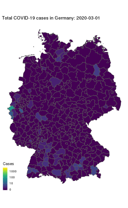
Our final map shows how the number of COVID-19 cases in Germany first started to rise in the South and West, and how they spread to other parts of the country. The geographical middle of Germany appears to be lagging behind in case counts even at later times. Note the logarithmic colour scale.
More info:
One caveat: This view does not take into account population density, which makes large cities like Berlin (north-east) stand out more towards the end. My Kaggle dataset currently includes population counts for the state-level only, but I’m planning to add county data in the near future.
If you’re looking for further inspiration on how to analyse this dataset then check out the various Notebooks (aka “Kernels”) which are associated with it on Kaggle. Kaggle has the big advantage that you can run R or Python scripts and notebooks in a pretty powerful cloud environment; and present your work alongside datasets and competitions.
Another Kaggle dataset of mine with daily COVID-19 cases, deaths, and recoveries in the US can be found here. This data also has a county-level resolution. It is based on Johns Hopkins University data and I’m updating it on a daily basis.