As far as rivalries go, R vs Python can almost reach the levels of the glory days of Barca vs Madrid, Stones vs Beatles, or Sega vs Nintendo. Almost. Just dare to venture onto Twitter asking which language is best for data science to witness two tightly entrenched camps. Or at least that’s what seemingly hundreds of Medium articles would like you believe. In reality, beyond some good-natured and occasionally entertaining joshing, the whole debate is rather silly. Because the question itself is wrong. It’s the whole “My kung fu is better than your kung fu” mindset that completely misses the point.
Because what matters the most is choosing the best tool for the specific job. Data challenges can be so diverse that no single language could possibly be best suited to solve them all. It’s like the no-free-lunch theorem, only for the tools that build those lunch tools. Which makes it the no-free-kitchen theorem, I suppose … . I shall be working on this analogy.
I argue that data analysis needs to be problem-centric and language-agnostic to tap into its full potential. Use whatever language gives you the best equipment to solve your problem. This also prevents you from only having a hammer and treating every problem like a nail. One recent development toward a problem-centric analysis style is the fantastic R package reticulate. This package allows you to mix R and Python code in your data analysis, and to freely pass data between the two languages.
The topic of this blog post will be an introductory example on how to use reticulate. We will approach a simple supervised classification problem by first exploring the data with ggplot2 plots, then turn to Python’s scikit-learn for modelling, and finally visualise the results again in R.
Note: you need at least RStudio version 1.2 to be able to pass objects between R and Python. In addition, as always, here are the required packages:
libs <- c('dplyr', 'tidyr', 'stringr',  # wrangling
          'knitr','kableExtra',         # table styling
          'ggplot2','gridExtra',        # plots
          'viridis',                    # visuals styling
          'reticulate')                 # e pluribus unum
invisible(lapply(libs, library, character.only = TRUE))
We’ll be using the famous iris dataset, which is included in R as part of the datasets package. Arguably the Hello World of supervised classification problems, this data describes the length and widths of sepals and petals from 3 different species of iris flower. Sepals are the green parts of a flower that first protect and then support the petals. Just in case you too were wondering that. Here are the first couple rows of the data:
| Sepal.Length | Sepal.Width | Petal.Length | Petal.Width | Species |
|---|---|---|---|---|
| 5.1 | 3.5 | 1.4 | 0.2 | setosa |
| 4.9 | 3.0 | 1.4 | 0.2 | setosa |
| 4.7 | 3.2 | 1.3 | 0.2 | setosa |
| 4.6 | 3.1 | 1.5 | 0.2 | setosa |
This is a small dataset with 50 instances each per species of iris flower:
iris %>%
  count(Species)
## # A tibble: 3 x 2
## Species n
## <fct> <int>
## 1 setosa 50
## 2 versicolor 50
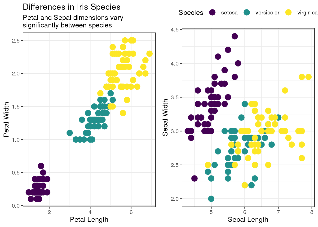
## 3 virginica 50As a simple example for exploratory data analysis plots we will look at the differences between those 3 species in terms of petal and sepal dimensions. Here, the gridExtra package provides the side-by-side layout:
p1 <- iris %>%
  ggplot(aes(Petal.Length, Petal.Width, color = Species)) +
  geom_point(size = 4) +
  labs(x = "Petal Length", y = "Petal Width") +
  scale_color_viridis(discrete = TRUE, option = "viridis") +
  theme_bw() +
  theme(legend.position = "none") +
  ggtitle("Differences in Iris Species",
          subtitle = str_c("Petal and Sepal dimensions vary",
                           "\n",
                           "significantly between species"))

p2 <- iris %>%
  ggplot(aes(Sepal.Length, Sepal.Width, color = Species)) +
  geom_point(size = 4) +
  labs(x = "Sepal Length", y = "Sepal Width") +
  scale_color_viridis(discrete = TRUE, option = "viridis") +
  theme_bw() +
  theme(legend.position = "top")

grid.arrange(p1, p2, layout_matrix = rbind(c(1,2)))
We find that there are clear clusters for each of the species - especially for setosa and in the petal dimensions. A well-trained classifier should be able to distinguish the three iris species. Now, R is perfectly capable of performing this classification task, but for the sake of the excercise we will turn to Python. Given the popularity of both ggplot2 and scikit-learn, such a workflow is certainly realistic.
First, we need to tell R where Python can be found. In reticulate, the use_python convenience function takes care of that; all we need is a path to the executable. On a Unix-based system, simply open a terminal and type which python, then paste the resulting path below. (Or look for python3 instead, but this should really become your default version because for Python 2 the time is running out). This is my path:
use_python("/usr/bin/python")Now you have the combined power of both R and Python at our fingertips. Use it wisely. In Rmarkdown, you can switch each invidual code chunk to the new language by putting {python} instead of {r} into the chunk header.
So, what’s the easiest way to find out that you’re in Python? You suddenly find yourself starting to count from zero:
foo = [1, 2, 3]
print(foo[0])
## 1The real advantage, however, is that we can now pass objects from R to Python, and vice versa. To use R objects in Python we access them using the r object and Python’s . (dot) notation. For instance, our iris dataset will be represented by r.iris, which is a pandas data frame:
print(r.iris.loc[:5, ["Sepal.Length", "Species"]])## Sepal.Length Species
## 0 5.1 setosa
## 1 4.9 setosa
## 2 4.7 setosa
## 3 4.6 setosa
## 4 5.0 setosa
## 5 5.4 setosaLet’s prepare a simple scikit-learn decision tree classifier. First, we import the necessary Python libraries:
import pandas
from sklearn.model_selection import train_test_split
from sklearn.tree import DecisionTreeClassifier
Then we split our iris dataset into train vs test samples using the train_test_split convenience method. Of course, in real life you want to do the train/test split before looking at the data. For the sake of clarity, we choose to explicitely separate out the predictor features vs the species labels:
train, test = train_test_split(r.iris,
                test_size = 0.4, random_state = 4321)

X = train.drop('Species', axis = 1)
y = train.loc[:, 'Species'].values
X_test = test.drop('Species', axis = 1)
y_test = test.loc[:, 'Species'].values
Those are now Python objects. In order to see and handle them in R you have to use the py$ object. This is the equivalent of the r. object for working with R variables in Python. For example, because X is a Python object this R code doesn’t work:
X %>% head(5) # doesn't workBut this R code does the trick:
py$X %>% head(5)## Sepal.Length Sepal.Width Petal.Length Petal.Width
## 41 4.5 2.3 1.3 0.3
## 16 5.4 3.9 1.3 0.4
## 26 5.0 3.4 1.6 0.4
## 99 5.7 2.8 4.1 1.3
## 5 5.4 3.9 1.7 0.4Now, let’s switch back to Python code. We wil fit a simple decision tree with sklearn, apply it to the test set, and visualise the results in R.
First the fit and prediction. One major advantage of sklearn is its intuitive and consistent syntax:
tree = DecisionTreeClassifier(random_state=4321)
clf = tree.fit(X, y)
pred = clf.predict(X_test)
Finally, we bring the test predictions back to R and plot some results.
foo <- py$test %>%
  as_tibble() %>%
  rename(truth = Species) %>%
  mutate(predicted = as.factor(py$pred),
         correct = (truth == predicted))

foo %>%
  head(4) %>%
  select(-Petal.Length, -Petal.Width) %>%
  kable() %>%
kable_styling()| Sepal.Length | Sepal.Width | truth | predicted | correct |
|---|---|---|---|---|
| 5.4 | 3.4 | setosa | setosa | TRUE |
| 5.1 | 3.3 | setosa | setosa | TRUE |
| 5.9 | 3.2 | versicolor | virginica | FALSE |
| 6.3 | 3.3 | virginica | virginica | TRUE |
p1  <- foo %>%
  select(-correct) %>%
  gather(truth, predicted, key = type, value = species) %>%
  ggplot(aes(Petal.Length, Petal.Width, color = species)) +
  geom_point(data = foo %>% filter(correct == FALSE),
             col = "black", size = 5) +
  geom_point(size = 2) +
  scale_color_viridis(discrete = TRUE, option = "viridis") +
  theme_bw() +
  theme(legend.position = "none",
        text = element_text(size = 16)) +
  facet_wrap(~ type)

p2 <- foo %>%
  select(-correct) %>%
  gather(truth, predicted, key = type, value = species) %>%
  ggplot(aes(Sepal.Length, Sepal.Width, color = species)) +
  geom_point(data = foo %>%
               filter(correct == FALSE),
             col = "black", size = 5) +
  geom_point(size = 2) +
  scale_color_viridis(discrete = TRUE, option = "viridis",
              guide = guide_legend(direction = "vertical")) +
  labs(color = "Species") +
  theme_bw() +
  theme(legend.position = "bottom",
        text = element_text(size = 16)) +
  facet_wrap(~ type)

p3 <- foo %>%
  count(truth, predicted) %>%
  complete(truth, predicted, fill = list(n = 0)) %>%
  group_by(truth) %>%
  add_tally(n, name = "true") %>%
  mutate(accuracy = n/true * 100) %>%
  ggplot(aes(truth, predicted, fill = accuracy, label = n)) +
  geom_tile() +
  geom_text(size = 5, color = "grey60") +
  labs(x = "True Species", y = "Predicted Species",
       fill = "Accuracy[%]") +
  theme_minimal() +
  theme(legend.position = "bottom",
        text = element_text(size = 16),
        axis.text.x = element_text(
          angle=45, hjust=1, vjust=1.1),
        axis.text.y = element_text(
          angle = 45)) +
  scale_fill_viridis(option = "viridis") +
  ggtitle("Classification\nDiagnostics",
          subtitle = str_c("Left: confusion matrix",
            "\n",
            "Right: misclassified\ninstances"))

grid.arrange(p1, p2, p3,
        layout_matrix = cbind(c(3), c(rep(1,2), rep(2,3))))
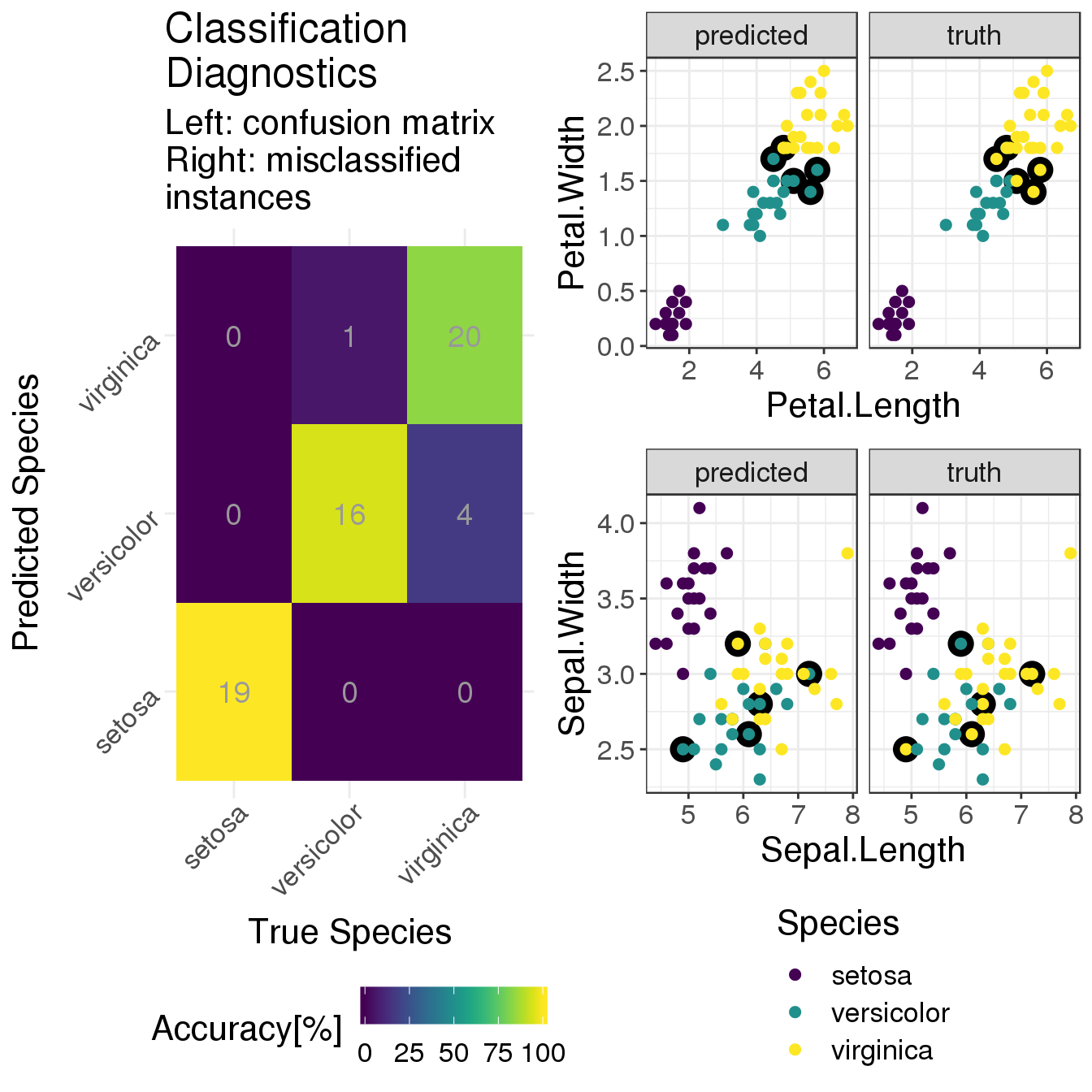
This plot layout provides diagnostics for the performance of the classifier:
On the left, there is a confusion matrix which shows how many test instances of each species were classified as one of the 3 species. The numbers are absolute numbers (remember that this is a small dataset) and the colours encode percentages. For instance, 100% of the 19 setosa instances were correctly classified as setosa. This is the classification accuracy, i.e. the number of true positives. The accuracies for the other two species are pretty high, too; with iris virginica having the lowest proportion of 20 out of 24 instances correctly classified.
On the right we show two sets of scatter plots that repeat the overview of petal (top) and sepal (bottom) properties from above. The difference is that now we (i) look at the test set only and (ii) plot the true classes on the right and the predicted classes on the left. The colour-coding is the same for both scatter plots (see legend at the bottom). In addition, all the misclassified instances have a black circle around them to highlight their position.
All in all, our simple classifier does a decent job. The setosas are clearly separated from the rest. And disentangling versicolor vs virginica is not trivial. Of course the performance could be improved, but this is not the topic of this post.
Because more importantly we saw how the reticulate approach allows us to seamlessly blend together R and Python code to use the combined power of both worlds.
So, the next time somebody asks you “Python or R?” just reply with a simple “Yes.” (#inclusiveor).
More resources:
For running R code in a Jupyter notebook with Python kernel there is the great rpy2 library combined with Jupyter’s line or cell magic.
In R, decision trees are implemented via the rpart package. For general machine learning infrastructure there are the popular caret and the new tidymodels; both led by developer Max Kuhn.
For creating visualisations in Python I recommend seaborn.